 Once a book leaves a writer's personal computer and goes out into the world, it no longer belongs to the author. Readers give a novel a life of its own through their personal interpretations.
In the few months since Artifact has been out, it's been fascinating to read reviews that focus on different aspects of the novel that the reviewers found compelling. I'm lucky the reviews have been overwhelmingly positive so far. But what I didn't expect was the reaction to my book cover.
I love my book cover. And from the enthusiastic comments I receive from readers, they love it as well. Then what am I talking about, you ask? I'm referring to the reaction from people who aren't my core audience of female traditional mystery readers.
As a graphic designer, I was able to design my own cover art. Part of a designer's job is strategy. One of the key questions a designer begins with is identifying the target audience. Therefore I studied the book covers of recent mystery novels I enjoyed that I knew had a similar target audience—books where I thought if a reader liked one of those books then they might enjoy mine, too. Here's a picture of a few of those books. Notice the similar elements in these books and my own cover.
The problem?
I may have been too narrowly focused. While my book cover has been successful at signaling to fans of "lighthearted, fun, well-researched, puzzle-plot mysteries with a strong-willed female protagonist and a dash or romance" that Artifact is for them, it turns out that the book has the potential for broader appeal.
1. ForeWord Reviews is a literary magazine that reviewed Artifact. They have gave it a great review, but in their email blast that promoted the review, they began: "Don't let Artifact's cover discourage you. It's a classic mystery that will appeal to those who enjoy complex puzzles—complete with quirky characters, suspense, and romance." Ha! I'm happy they decided to read and review it in spite of the cover.
2. I've been doing a bunch of events this fall to promote the book. On numerous occasions, men came up to me after I spoke to tell me that my treasure hunt mystery sounded like something they'd love, but that they'd never pick it up based on the book cover. I admit I assumed it would be women who would be my primary readers. But looking at the reviews of Artifact on Amazon, roughly half of the reviews are from men. Live and learn!
3. This is something I already knew, but didn't realize would be an issue: the book cover looks like it could be a Young Adult book. The book is definitely YA-friendly—there's no sex or violence or swearing on the page—so it's appropriate for young teens. The cover is very appropriate in that sense. But I've learned that some people won't pick up a mystery if they think it's specifically for young adults. And the flip side is that some readers enjoyed it as a Young Adult book and wondered why it wasn't categorized as a YA book.
Book covers are completely subjective, of course, so no cover is going to please everyone. Even if I could go back in time, I'm not sure I would go back and change my cover. Though I may lose some readers because of the cover, I'm also able to find mystery readers who have a greater chance of enjoying the book once they pick it up. There are so many books published each year—I read some statistics that put the number at over a million—that it's important to stand out quickly to the people most likely to appreciate a particular book.
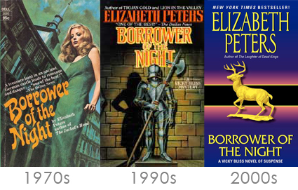
Lastly, styles of book covers change over time. Here's an example of the book cover of one of my favorite books, Borrower of the Night by Elizabeth Peters. You can see how it has changed over the decades.
Will Artifact ever get a new cover? Who knows. For now, I'm having a lot of fun hearing from readers who've found the book, regardless of why they picked it up.
—Gigi

